Best JSON Visualizer Tools: Jsoncrack, Tableau & More
TLDR; Effective data representation is crucial for simplifying complex information. When choosing a visualization tool, consider factors like data import, file size limits, performance, privacy, and security. We've highlighted top tools - Jsoncrack, RAWGraphs, Tableau, and Microsoft Power BI - offering various graph types, large file handling, interactivity, and security, making JSON data analysis efficient. Our article provides step-by-step guides for these tools, enabling you to uncover patterns and insights in your JSON data through visually engaging charts, enhancing data-driven decisions in your workflow.
The Potential of JSON Portrayal to Transform Complex Data into Graphical Elements
JSON is a chosen format in the data world thanks to its simple, readable format for humans and machines. However, when JSON files get big, they can be tough to apprehend, that's where data portrayal comes in. Without these tools, it's hard and time-consuming to analyze big JSON files for insights.
Luckily, using these tools, you can turn a tough task into a simple one, making raw JSON data easy to understand and act on. These tools do more than make the data look good, they act as a bridge, taking complicated data and turning it into meaningful senses. These tools can quickly change complex data –including but not necessarily limited to JSON– into easy-to-understand charts and graphs, revealing hidden trends and connections.
Because these tools are interactive, they make it easy to explore the data and spot any mistakes. Moreover, they help drive data-led decisions and make it easy to share findings, letting everyone benefit from the insights gained in the data transformation process.
Table of Contents
- Jsoncrack for JSON Visualization
- RAWGraphs JSON Analytics Tool
- Tableau Data Analytical Tool for Raw JSON File Visualizations
- Microsoft Power BI Data Analysis and Visualization Tool
Transform Raw JSON into Visual Analytics for Enhanced Data Interpretation?
Transforming a complex set of data into an easy-to-understand format is crucial for effective data storytelling in data analysis-related tasks. Good visualizations could help in:
- Understanding and simplifying data analysis
- Narrate a compelling story out of complex data including JSON files
- Uncovering hidden patterns
- Help to make quick and informed business decisions
How to Choose the Right Graph-Making Tool for Raw JSON Analysis?
When choosing a tool for creating representations out of your JSON data, there are some key aspects and features that you would eventually face in the process of illustrating your JSON data. You should consider these aspects beforehand; here we bring you an overview of some of the most important ones.
Types of Charts and Graphs Available in a Data Visualization Tool
Tools provide different types of graphs such as line graphs, bar charts, pie charts, histograms, scatter plots, and heat maps, each offering unique insights based on the data context. Understanding the context of your data is crucial for deciding which type of graph or chart you need to use.
Below is an overview of the various graph types generally available in most tools. This should give you an insight into the context in which each graph type is best utilized:
| Graph Type | Best Used For |
|---|---|
| Line Graphs | Displaying changes over time |
| Bar Charts | Comparing quantities across different categories |
| Pie Charts | Showing proportions of a whole |
| Histograms | Representing the distribution of continuous data |
| Scatter Plots | Displaying the relationship between two numerical variables |
| Heat Maps | Visualizing large datasets and identifying patterns |
Customization Options Obtainable in a Data Visualization Tool
The ability to customize some of the graph options including colors, scales, axes, and labels is a key aspect of data visualization. Customization options allow you to emphasize key insights and make data more digestible for your audience. Once visualized, you might need to convert your JSON data to CSV or other formats for downstream BI tools.
Interactive Visualizations Option in Data Transformation Process
These are dynamic data representations that allow users to engage directly with their data. Unlike static graphs, interactive ones enable users to adjust views, drill down for details, or apply filters for specific data segments. Interactive visualizations can reveal intricate patterns or relationships not readily visible in static visualizations.
Renowned tools like Tableau and Microsoft Power BI excel in this domain. They provide intuitive interaction through customizable charts, tooltips, zooming, and panning. Additionally, these tools allow the creation of dashboards for simultaneous viewing and manipulation of multiple visualizations.
Choosing a data imaging tool involves balancing ease of use and having access to advanced features.
Simple tools are more user-friendly and straightforward but may lack complex functionalities and full-feature toolsets. Advanced tools offer more features but have a steep learning curve. Your choice should factor in your expertise, project needs, and time for learning.
Assessing Integration Capabilities in a Data Analysis and Visualization Solution
When selecting a suitable graph tool for illustrating JSON data, integration capabilities with various data sources are paramount. An effective tool should seamlessly integrate with databases, cloud storage, and APIs to access and process the data. This integration facilitates the smooth transformation of data, irrespective of its source, into valuable insights.
Such integration capabilities are essential to ensure the tool's versatility in handling diverse data scenarios. For instance, a tool that directly interacts with cloud-based databases could be beneficial when working with large-scale, distributed data. Similarly, for real-time data processing, API integrations become crucial. Therefore, comprehensive integration capabilities substantially augment the scope and effectiveness of a representation tool, thus making it a crucial criterion for selection.
Prioritizing Sharing and Collaboration Along the Way of Visual Data Interpretation
Sharing and collaboration are key in a team-based or enterprise setting, making them critical factors when choosing a graph tool. Tools that promote the sharing of visualizations and collaborative work foster an environment conducive to collective progress and insights.
Such features enable team members to cohesively work on data representation tasks, discuss insights, and build on each other's ideas. This collaborative approach not only enhances productivity by avoiding redundancy but also cultivates a data-driven culture within the organization.
Key Features to Consider for Transforming Raw JSON Data into Graphs
There's an array of tools available today, each with its unique features, capabilities, and ideal use cases. In this section, we'll provide a brief but to-the-point overview and a step-by-step guide of some of the available tools that we hand-picked for making graphs out of raw JSON files, focusing on the following aspects:
- Data Import
- File Size Limitations
- Graph Types
- Export Options
- Privacy and Security
- Customer Support
- Performance
- Whether they are Free or require a license.
Standalone Tools for JSON Visualization in a Graphical Format
We have gone through a quest to find the best solutions —both online tools and native applications— to visualize large raw JSON files. In the following sections, we will dive into a step-by-step tutorial on how to best utilize each of these tools, to import and visualize data from a large JSON file. Each tutorial will contain definitive instructions including screenshots and detailed instructions to make the process seamless for you.
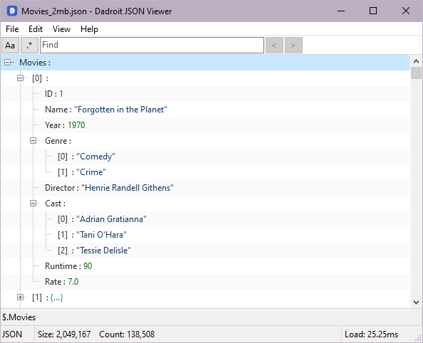
Throughout this blog post, we’ll be using a movie Dummy JSON Data generated using Dadroit JSON Generator. If you need test data without generating it, check out our guide on open JSON datasets, or learn about handling large JSON files before visualization.
Jsoncrack for JSON Visualization
Jsoncrack is an online JSON viewer that provides a simple way to view and format JSON data. After having the JSON data imported into the tool, you can see a node-based view of your JSON file, so in comparison with other tools that provide much more versatile graph types, this tool is a bit limited. Now let’s traverse some of the previously mentioned key points of Jsoncrack:
- Data Import: Supports JSON data import, as well as other formats like YAML, XML, TOML, and CSV.
- File Size Limitations: Does not support large JSON files, limiting its usability for bigger datasets.
- Graph Types: Primarily a node JSON viewer and doesn't provide various graph types.
- Performance: Performance could be an issue with larger JSON files.
- Export Options: Allows users to export formatted JSON data, as well as an Image file of the node graph.
- Privacy and Security: As an online tool, data security could be a concern, and you should ensure that sensitive data isn't shared.
- Customer Support: Limited customer support is available via email.
- Free or License Required: There is an available free version of the tool, but also has some extra features available in license-based accounts.
A Step-by-Step Guide on How to Use Jsoncrack for JSON Visualization
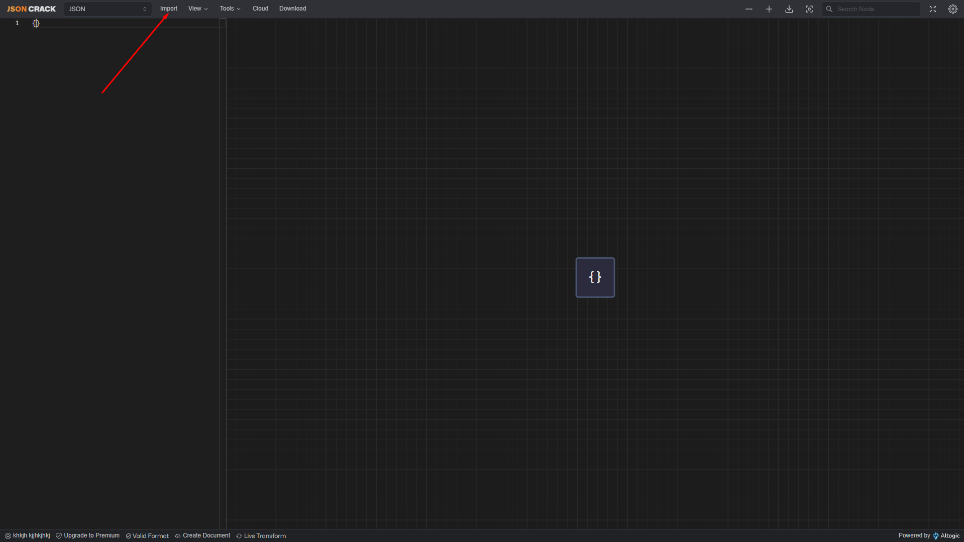
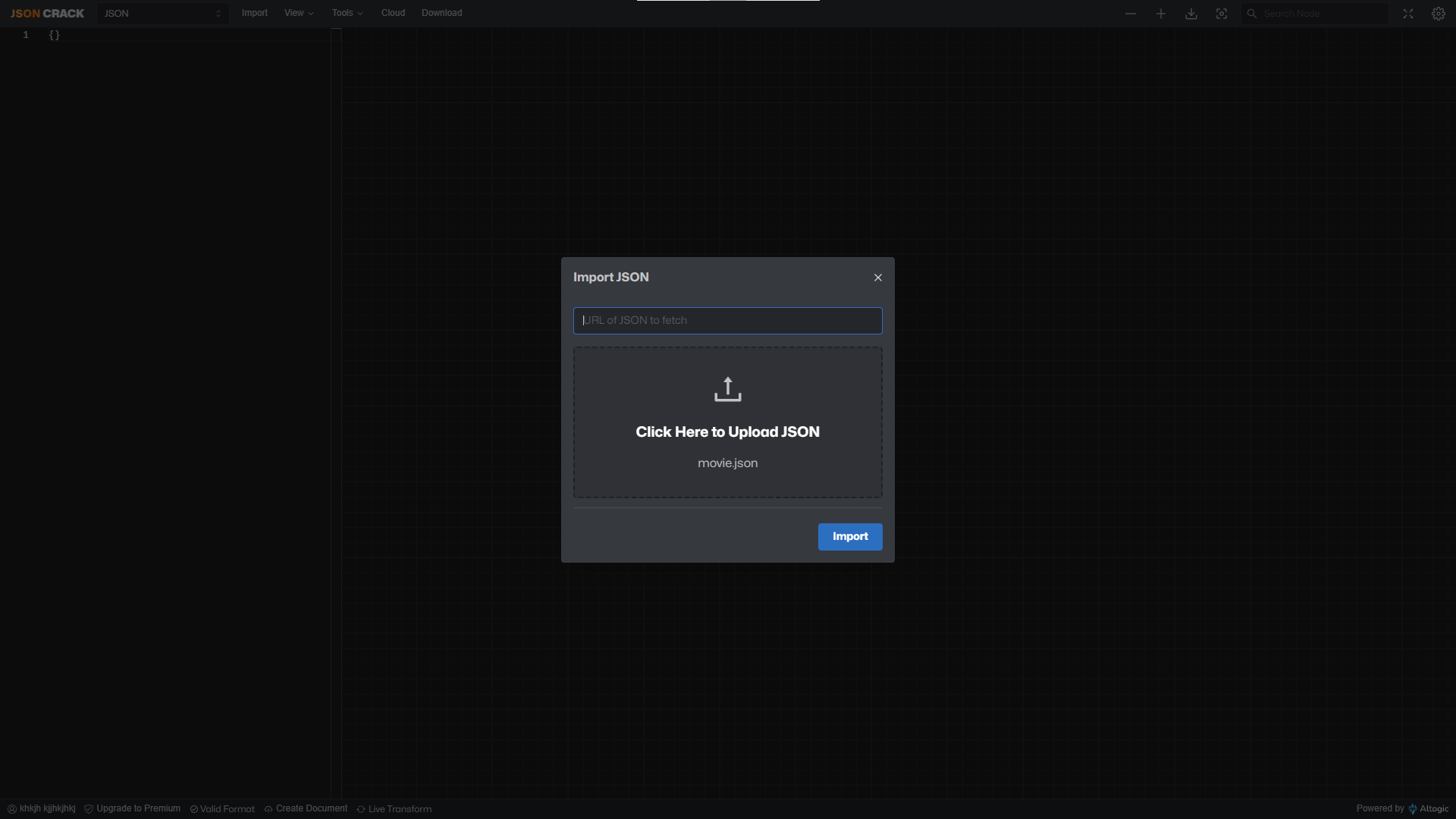
- First, you need to head to the Editor in Jsoncrack. Then head into the import option to import your JSON file:
- After importing, you can see the node view graph of your JSON data, we used simplified JSON data with only 1 movie record because Jsoncrack is not suitable for large-size JSON files:
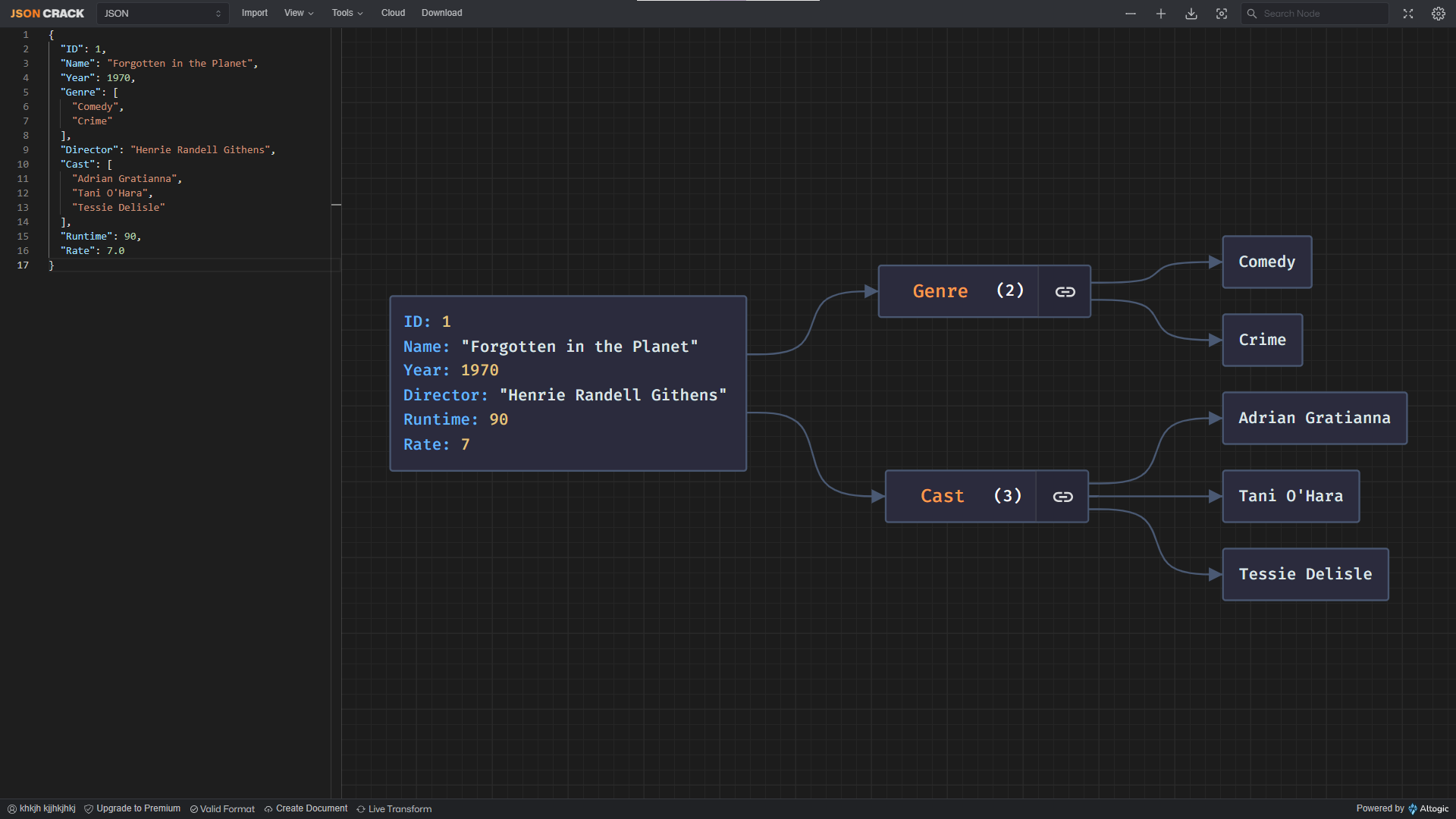
You can fold and unfold nodes of your JSON graph as well, for the ease of traversing the tree. You can also use our online JSON viewer at V Web, Dadroit V Web, if you prefer browsing large JSON data in a solid tree viewer. It runs entirely in your browser and processes everything locally, so nothing is uploaded and your data stays private. For more options, explore the online JSON tools hub.
RAWGraphs JSON Analytics Tool
RAWGraphs is an open-source data representation tool designed to simplify the process of illustrating complex data.
- Data Import: Supports tabular (TSV, CSV, DSV) and JSON data import via its web-based tool.
- File Size Limitations: This tool does not handle large-size JSON files bigger than a couple of MB.
- Graph Types: Supports various graph types, including Scatter plots, Bar charts, Pie charts, and more.
- Performance: Handling larger datasets can be challenging for it.
- Export Options: Supports export formats including SVG and PNG.
- Privacy and Security: Operates client-side, which means your data stays on your computer unless you decide to share it.
- Customer Support: Support is available through the community and GitHub issues, and there are some tutorials available on their website too.
- Free or License Required: RAWGraphs is open-source and free to use.
A Step-by-Step Guide on How to Use RAWGraphs to Make Graphs Out of Raw JSON Files
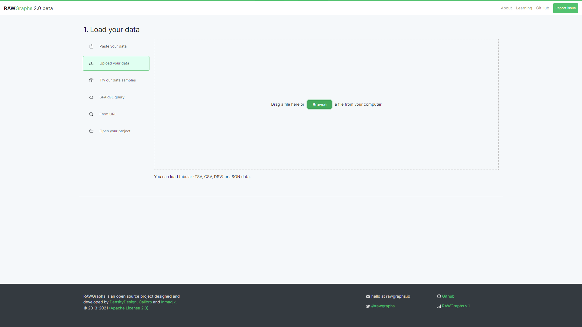
- First, you can head to the RAWGraphs web app and see the place for your input data, which you can import or paste your data into the app.
- Then you can import your data, which in this case we are going to use the movie JSON data we mentioned at the beginning of the post, after a couple of seconds, RAWGraphs is able to open the 2MB imported JSON file:
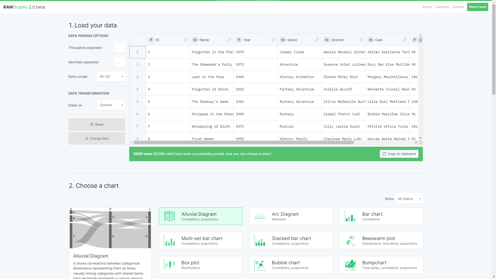
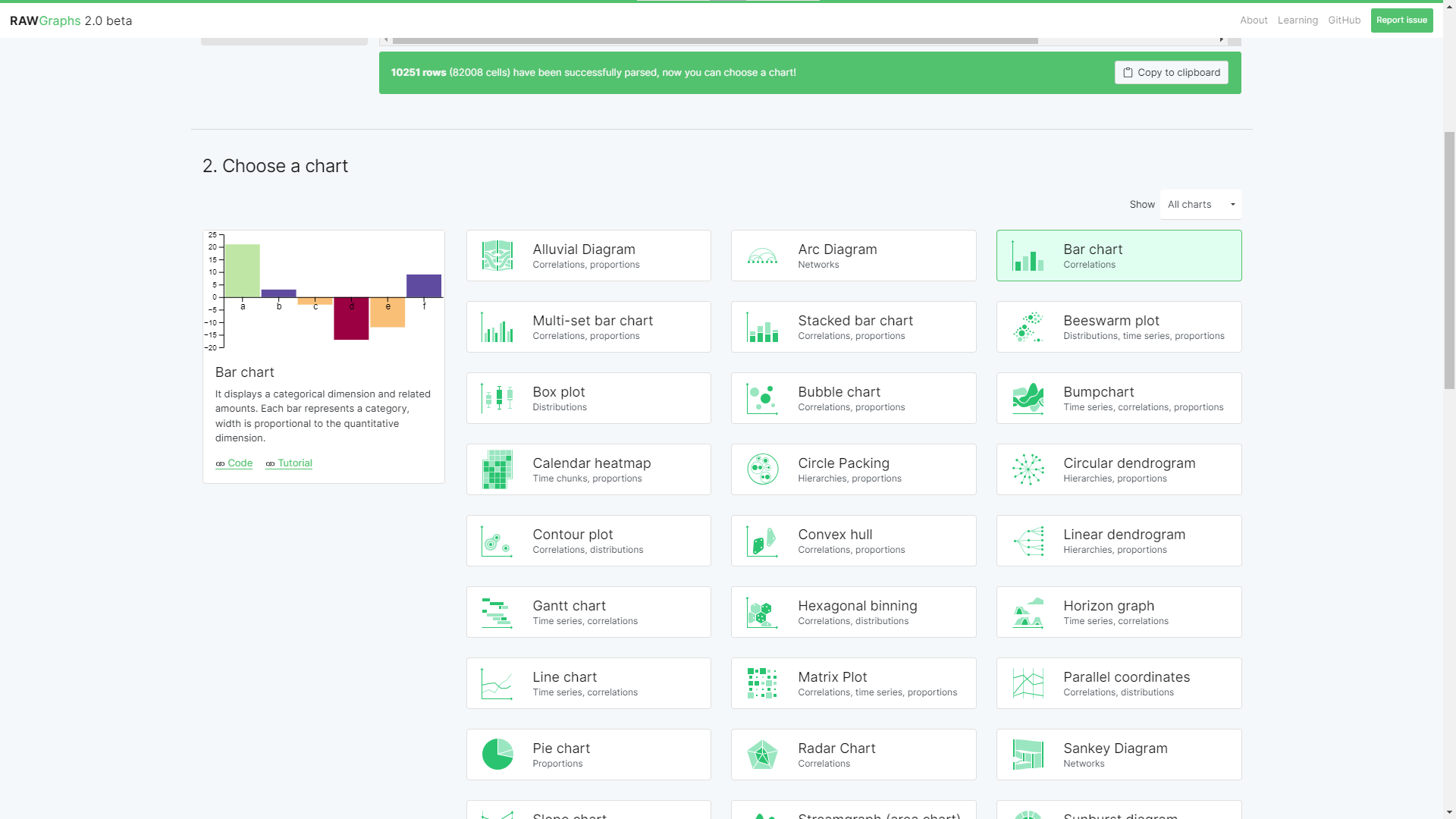
- Then we should select the chart type –here, for example– we chose Bar chart:
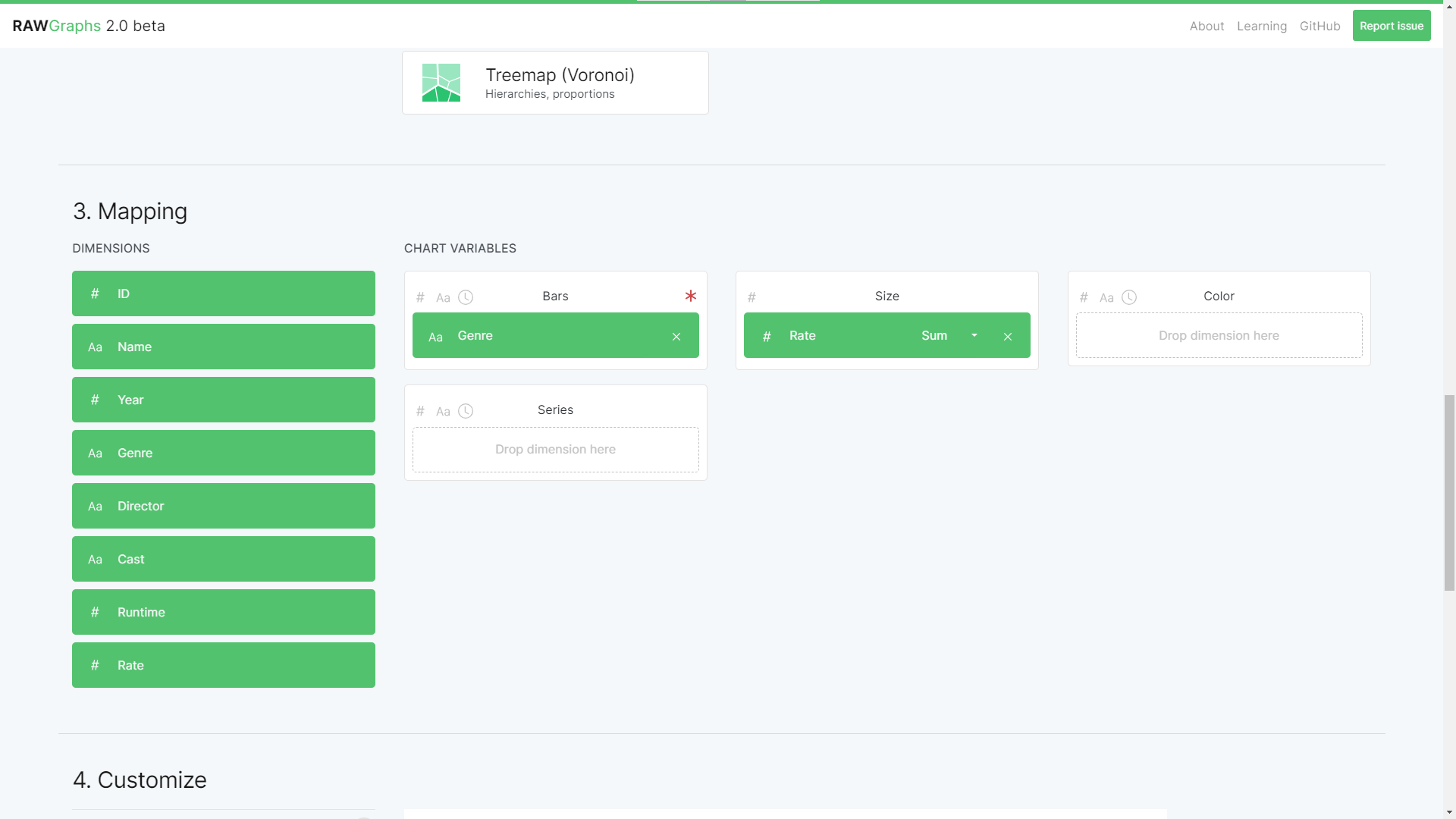
- After choosing the chart type you should choose what field of your data you want to be the bars and the sizes, here you can see that we chose the
Movies'Genreand their respectiveRateto be ourxandyaxis for the chart:
- As you can see in the following, the function in which the size axis is calculated can be set using these available functions:
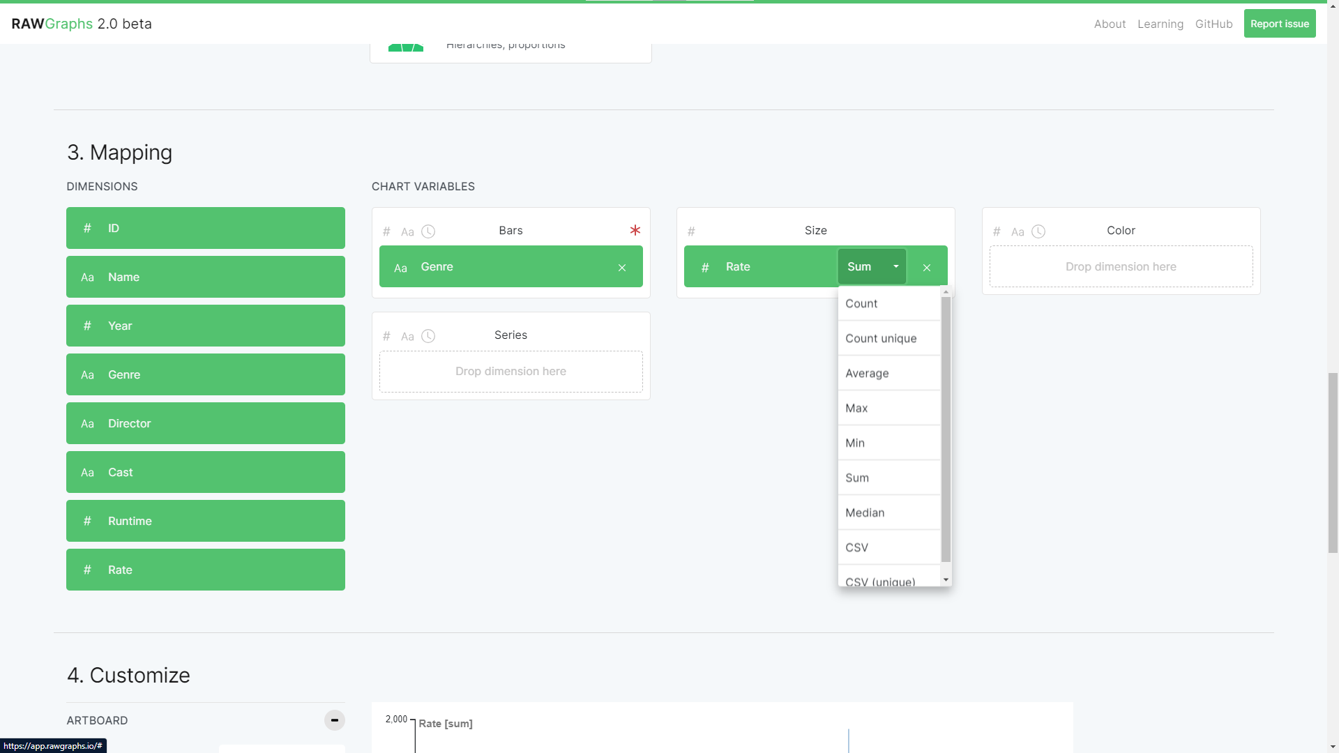
- Then you can see that seamlessly the RAWGraph tool would be drawing the Bar chart when we set the function to be Average:
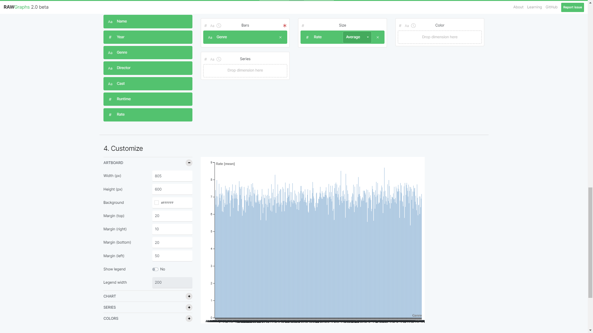
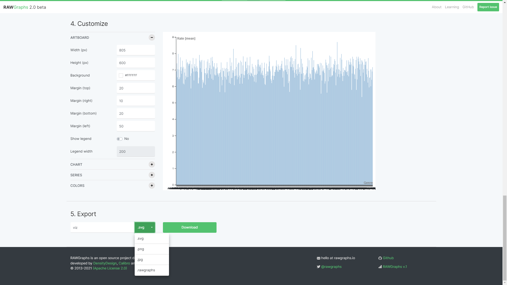
- As you can see, the resulting graph can be exported and saved in
SVG,PNG,JPG, and.rawgraphformats:
There are good tutorials on their website if you want to learn each chart, and you may see the versatility of the graphs that could be made using RAWGraphs, in their gallery.
Tableau Data Analytical Tool for Raw JSON File Visualizations
Tableau is a powerful tool used for illustrating large datasets and is particularly popular in the business intelligence industry. Here is a list of key points about Tableau:
- Fast Analytics: Offers quick data connection and portrayal.
- Ease of Use: Allows intuitive data analysis with drag-and-drop features, no programming needed.
- Versatility with Data: Capable of handling data from various sources such as spreadsheets, databases, Hadoop, and cloud services.
- Smart Dashboards: Enables the combination of multiple data views for richer insights.
- Automatic Updates: Provides either a live data connection or scheduled updates based on your preference.
- Easy Sharing: Allows the sharing of dashboards online and on mobile devices with just a few clicks.
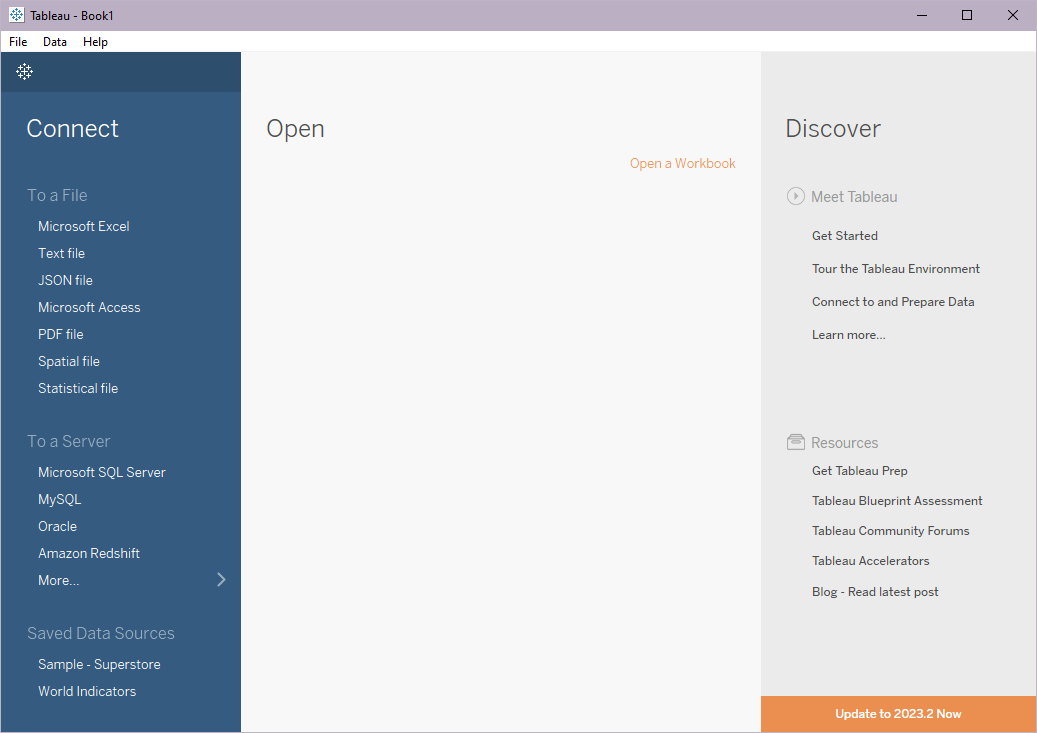
- Data Import: Tableau's web app doesn't support JSON import, but its desktop application does.
- File Size Limitations: Tableau's ability to handle data depends on the specific product you use. Tableau Public, the free version, has certain limitations on data size, in the Tableau Desktop application a single JSON file cannot exceed 128MB file size.
- Graph Types: Tableau supports a variety of graph types, including line graphs, bar charts, scatter plots, and more.
- Performance: Known for its robust performance, Tableau can handle large datasets efficiently.
- Export Options: Tableau offers various export options, including PDF, Images, Data, Crosstab, and Tableau Workbook.
- Privacy and Security: Tableau follows industry standards for data privacy and security, providing features like row-level permission and user filtering.
- Customer Support: Tableau offers extensive customer support through its online help center, user community, and direct support.
- Free or License Required: Both free (Tableau Public) and paid versions (Tableau Desktop, Server, and Online) are available.
A Step-by-Step Guide on How to Use Tableau Desktop to Generate Graphs from Raw JSON Files
- Tableau supports importing raw JSON files through its Desktop app. After downloading and installing it, when you first open the Tableau Desktop application you’ll be able to see a list of supported files including JSON to import under the Connect section:
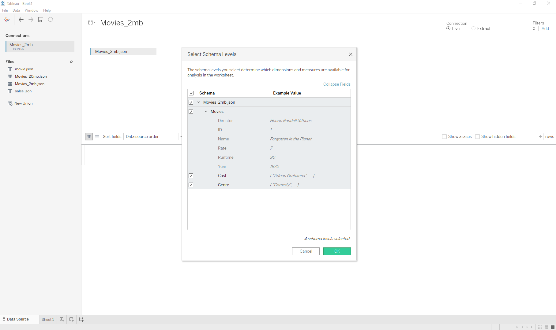
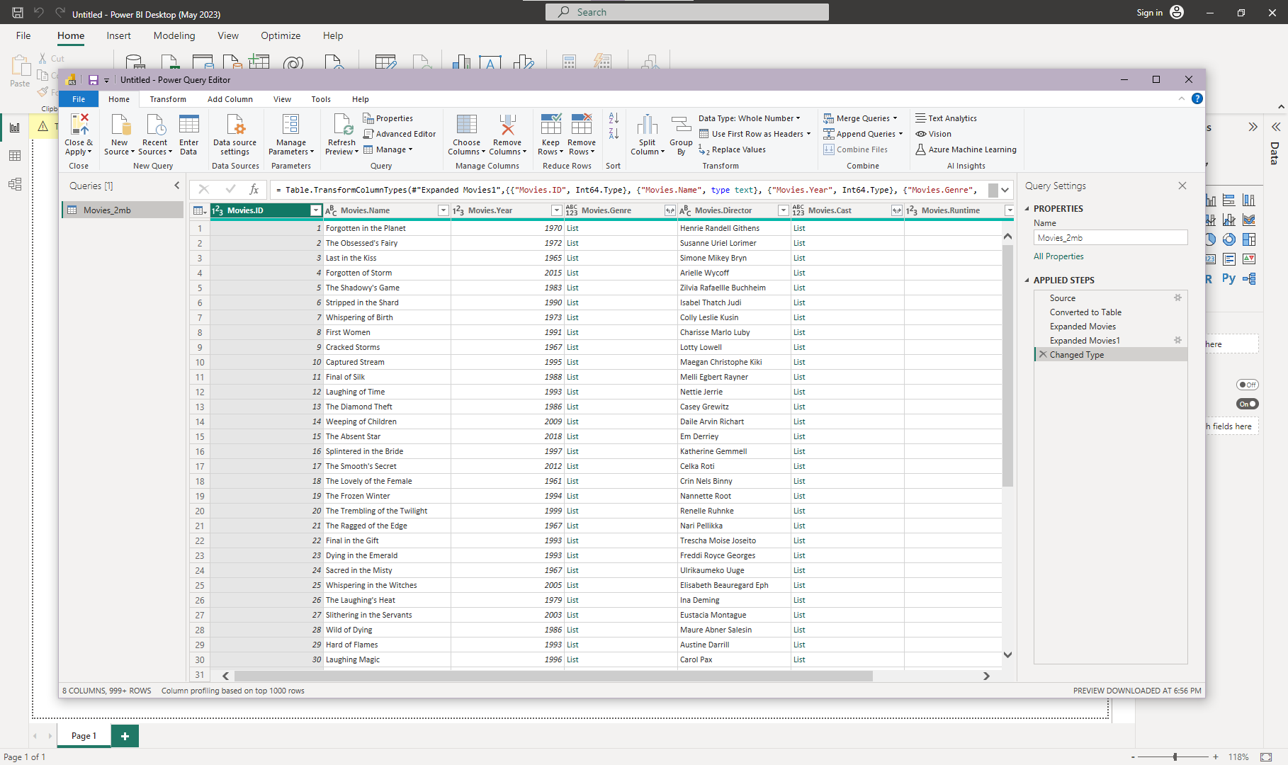
- After selecting the Import JSON option, a pop-up window opens for you to select the schema you need from your JSON file, here, as mentioned at the beginning of the post, we chose the movie sample file and all its fields:
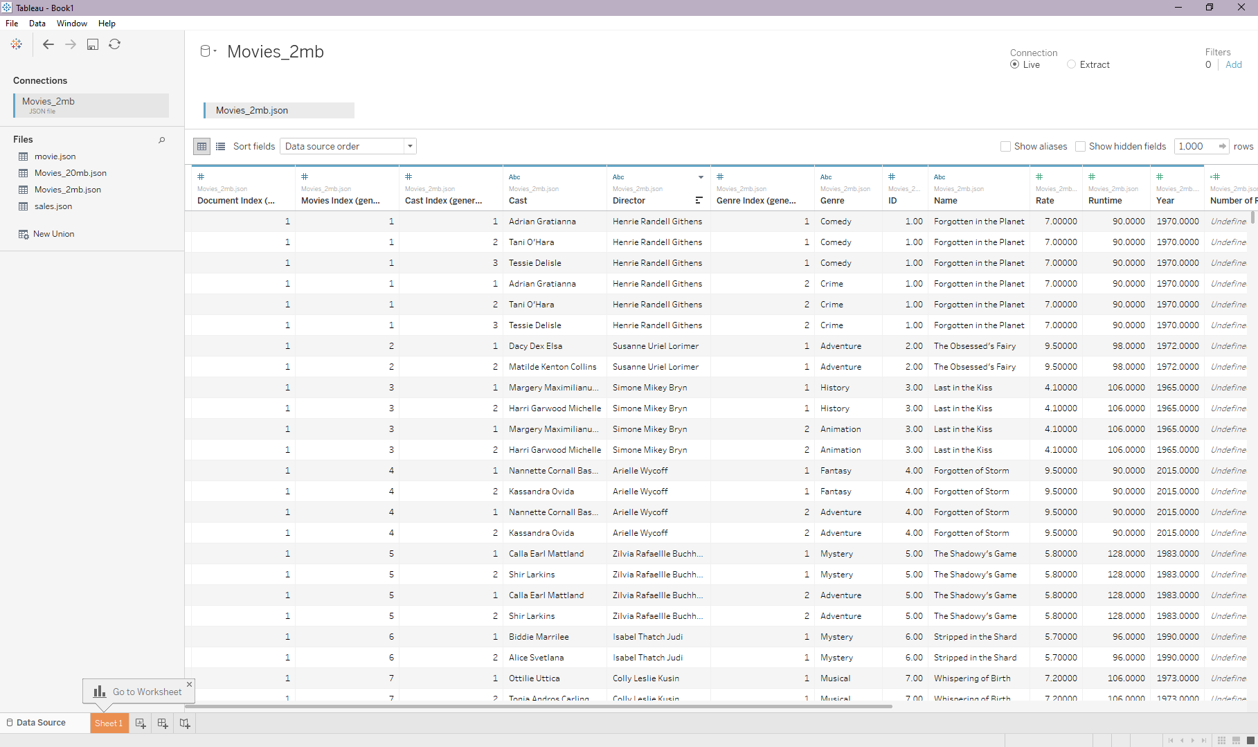
- After that, the application comes to a window showing the records of your data, flattened for ease of processing:
- As the hint pop-up says in the app, you can then go to the worksheet, which would direct you to the place where you can start making your graph out of imported JSON data:
- Then you can select a field from Dimensions and drag it to the Columns input section to be an axis in your final graph, we chose Genre for example:
- Then you can expand Source Measures to choose from them for your other axis —rows:
- After selecting and dragging the chosen
Source measure, which in this case we chose Rate, you can see that there is a function to choose from for the calculation over the respective axis: - As you can see, this is our final graph of the Genre of movies on the horizontal axis, and their respective average Rate on the vertical axis:
You can read further on the official documentation for working with JSON files in Tableau, and also Tableau Dashboard Showcase shows you some of the best and most featured visualizations made by Tableau users for inspiration.
Tableau has an interactive view by adding filters, like limiting a field’s values, and also much more versatile features, go ahead and start learning about Tableau.
Microsoft Power BI Data Analysis and Visualization Tool
Microsoft Power BI is a business analytics tool that offers data visualization capabilities, making it another strong choice for handling large JSON files in the process of visualization.
- Centralization of Data: Enables creation of datasets from any data source, fostering a single source of truth for all data.
- Interactive Visuals: Offers AI-powered tools and a user-friendly canvas for generating compelling data representations.
- Collaborative Insights: Facilitates the sharing of insights across teams, enabling quicker decision-making.
- AI-Assisted Reporting: Introduces Copilot, a feature that uses AI to assist in report generation from raw data.
- Integration: Part of the Microsoft Power Platform, enabling seamless integration with other Microsoft and external services.
- Data Import: Power BI supports JSON data import, providing an edge over many other visualization tools.
- File Size Limitations: Suitable and supporting large-size JSON files below 1GB.
- Graph Types: Power BI supports a comprehensive list of graph types, such as line graphs, bar charts, scatter plots, pie charts, and more.
- Performance: Power BI provides robust performance when handling large datasets.
- Export Options: Export options include PowerPoint, PDF, and Excel.
- Privacy and Security: Microsoft follows strict privacy and security norms. It provides features like row-level security and data encryption.
- Customer Support: Power BI provides extensive customer support through documentation, forums, and direct support.
- Free or License Required: Both free and paid versions are available. Provides options to start for free or download Power BI Desktop for richer data reporting.
A Step-by-Step Guide on How to Use Microsoft Power BI for JSON Visualization
Here we are going to use the Microsoft Power BI Windows application to make graphs out of our movie JSON data file:
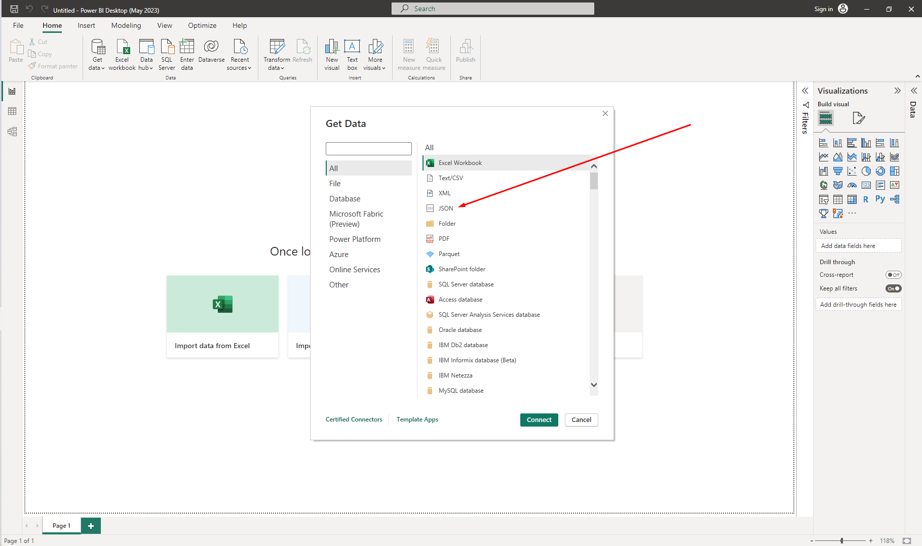
- When you open the Power BI application, you’ll be presented with these options, you can use the Get Data option to import JSON files into the app:
- Then you can choose JSON from the available list to continue with.
- After selecting a JSON file, you’ll be able to see all of the data listed as a table in front of you. Here’s a view of the
movieJSON file opened in Power BI.
- Then use the Close & Apply option to save your data.
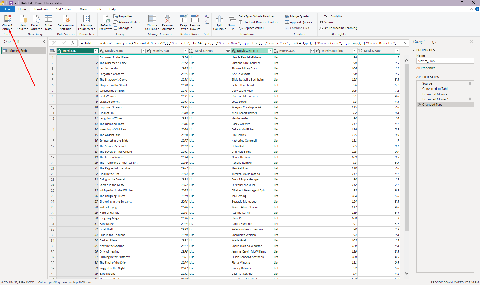
- After loading the data, you’re ready to make graphs out of your imported JSON data.
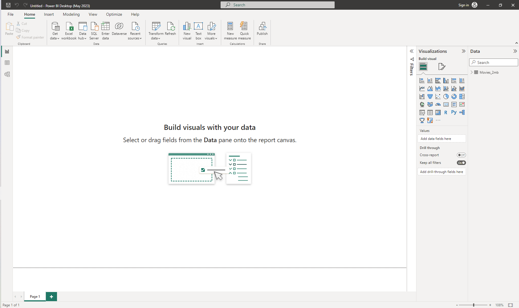
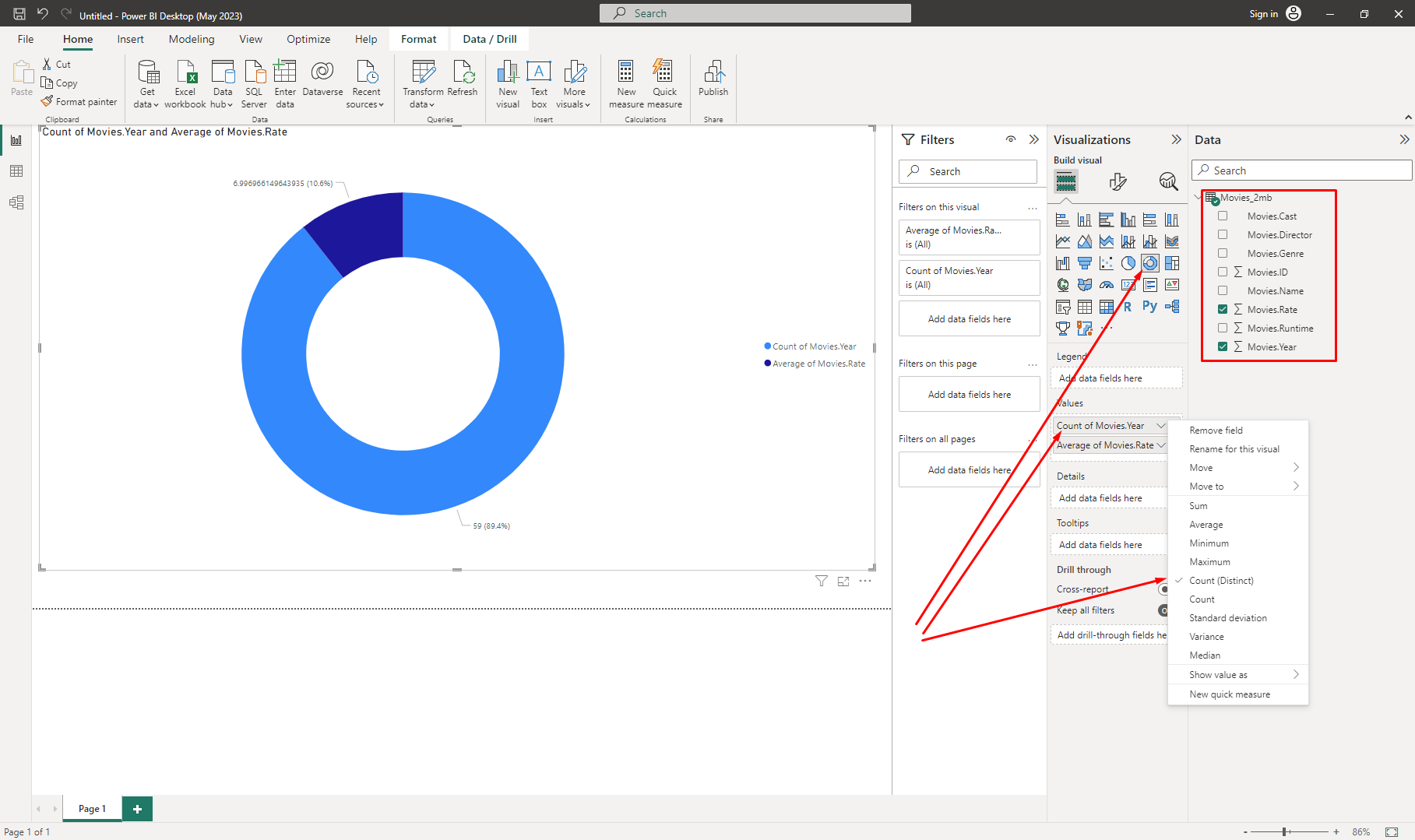
- Here you’ll be able to select from this list the type of chart you want:
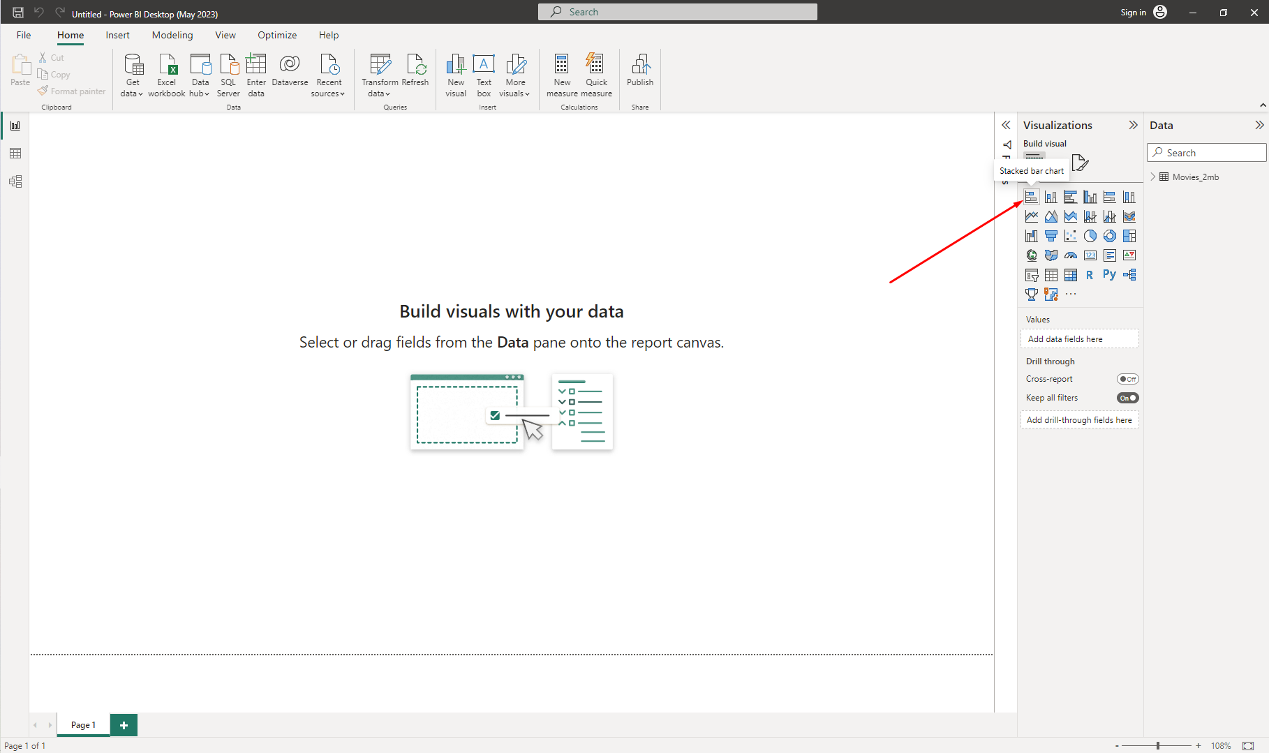
- After double-clicking on the selected visual, you can expand the
moviedata to choose from its fields for your graph. Here we choseRateandYearand then selectedCountandAveragefunctions for each one of them respectively:
Importing JSON data into Microsoft Power BI opens the door to dynamic and insightful visualizations. By following the precise steps for data transformation and mapping, you can harness the potential of your JSON files to create meaningful reports and dashboards. This process empowers you to make data-driven decisions with clarity and precision, making your business analyses more impactful and efficient.
Conclusion Thoughts on How To Visualize JSON Data
In conclusion, visualizing JSON data can simplify the data analysis process, transforming raw data into easy-to-understand visual formats. Tools such as Tableau and Microsoft Power BI offer a variety of features that can help turn complicated JSON data into clear and insightful graphs.
As we've explored in this guide, the selection of the right visualization tool requires careful consideration of several factors, including graph types, performance, file size limitations, privacy and security, export options, and pricing. We've explored how these factors apply to a selection of the most popular and suitable visualization tools and provided step-by-step guides on how to use them.
While we've focused on JSON data in this post, it's worth noting that these concepts and tools can be applied to a variety of data types. As the demand for data-driven decision-making continues to rise, the ability to transform raw data into meaningful insights will undoubtedly remain an invaluable skill.
Keep in mind that every tool has its strengths and weaknesses, and your choice should be tailored to your specific needs and level of expertise. Don't be afraid to try out different tools and methods until you find the one that best suits your needs.
As always, the goal is to make data more approachable and understandable, paving the way for informed decision-making and insight-driven action. Enjoy your insightful JSON visualization!